Visualising with Plotly - Where are Australian jobs growing?
28 Mar 2017A University of Melbourne training on Plotly.js was held on 22-23 March, 2017. See summary notes here - https://maegul.github.io/DataViz_web_plotly_cheat_sheet/. The focus was on using the Plotly javascript library to enhance research output. Focus on interactivity, through buttons, rollovers were useful. Loading csv files were especially important for me. I loaded two of my datasets below.
See DataVis at:
- https://areff2000.github.io/plotly_training_Mar2017/ULEDGraph.html - simple (Jun '17). (Update: Nov '17 - complex | Sony 2018 | Data 2018)| PRICE hipster
- https://areff2000.github.io/plotly_training_Mar2017/testBubble.html.
- https://areff2000.github.io/plotly_training_Mar2017/plotly_csv.html.
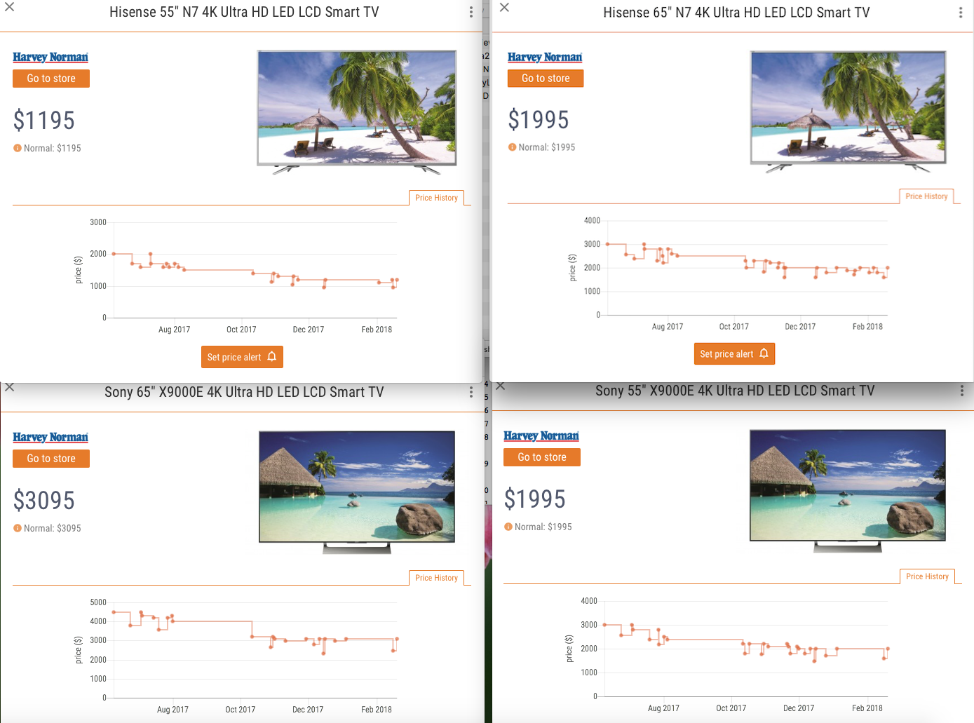
The 1st dataset compares 4K Hisense TV prices, by size, by retail vs RRP, by model. Data …is in Source.
The 2nd dataset looks at World GDP over 2,000 years as a bubble chart
This 3rd dataset looks at regional growth of employees, from 2002 to 2014. Regional growth is shown as a % change over four years.
See a major output below.Data comes from: Figshare: see https://doi.org/10.6084/m9.figshare.4056282.v6 Full Screen
Making a shareable timeline
New #datavis at: My NBN Timeline: Feb-July 2017.
To make your own timeline, create a Google Sheet with details; Start here: http://timeline.knightlab.com/#make
NBN Speedtest - 4-8 Aug 2017
My new NBN link: Telecube HFC 50/20 - tested 8.00pm Fri to 8.00am Mon
New #datavis at: https://plot.ly/~areff20000/46/ (including data).
Update: New data - Telecube HFC 100/40 - tested May '18 at: https://plot.ly/~areff20000/50/