Visualising the value of the NBN - calculated with Observable
01 May 2018A University of Melbourne training on Interactive Data Visualisation was held on 17,19 April, 2018.
Observable is a remarkable tool that combines, html control elements, plot.ly data visualisation and javascript calculations to
produce interactive, attractive and reactive calculations and visualisations. See my Observable NBN model here.
See an interesting Observable model of a spinning globe and another(using D3).
See my simpler version here:
Documenting the Observable Model
A 5 page explanation of the model is available at Figshare: https://doi.org/10.6084/m9.figshare.6030926
Sample screenshots
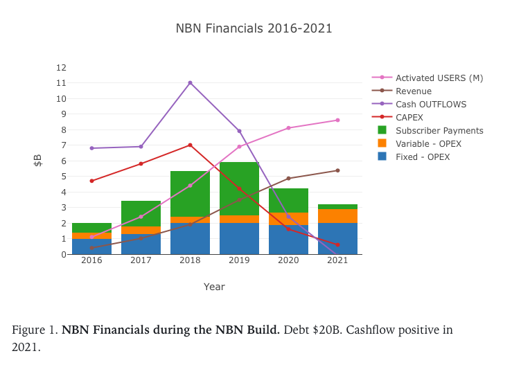
Figure 1. Financial Graph from Model (v1)
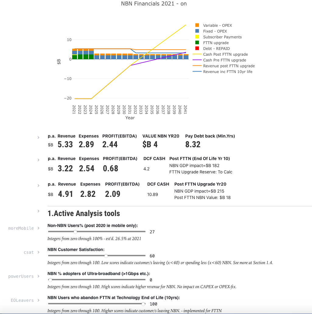
Figure 2. Cashflow Graph, Summary values and Model Sliders (Final Model)
Calculating the value of the NBN
I used Observable to make a dynamic, interactive model to calculate the value of NBN. I used html sliders to control various assumptions, such as mobile vs fixed broadband use, % of gigabit users, % debt repaid per year.
See Observable and Plot.ly training material, from the Unimelb course, at:
- Part 1 - Fundamentals
- Part 2 - Interactivity
- Part 3 - Data in javascript
- Part 4 - Data visualisation
See sample Heatmap from Observable output
Link to full page.